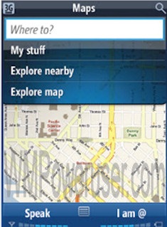
WMPowerUser.com, a Windows Mobile focussed site, seems to have come up with some screen shots of Windows Mobile 7. This mobile OS will allegedly be hitting the marketplace in Spring 2010

Is it pithy to say that the phone icon has been ripped off? Or to question the need for the time to be present in three different formats n this, the home screen? Or to explain how I think the usability of the CoverFlow-style-Dock-ripoff is a right pain in the arse?
Does it make it worse when you look at the positioning of the signal strength and battery and volume indicators in this additional screenshot?

They shouldn’t change position like that, should they? At least they’ve got time to fix it but the amazing thing is that no-one in the WM site above seemed to notice any of the bad things?
At least it’s shiny. That’s what they put on Vista’s epitaph.