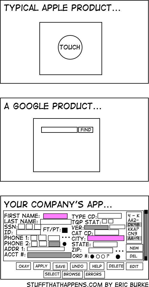
I love this. It’s a very simple and concise way of showing how bad user interface design can be and it draws on our experiences with media darlings Apple and Google.
While the implementation details may differ (entering a search term is very different to submitting taxes), there have to be ways that we can streamline things. Cookies for example, reduce the need for me to keep entering usernames and passwords, as does Apple’s Keychain.
User Interface Design is something that is harder than it sounds and really involved removing assumptions. There’s been a lot of hubbub about how Google is the master of advertising and yet doesn’t get clicks on advertising from their front page. Their front page has a minimalist aesthetic but is arguably one of the most visited pages in the world. Or is it? Consider the deals they have struck with Apple? Firefox? Their front page is for them alone to advertise and it’s an incredibly potent branding message.
Is there any amount of money that could get you placement on their front page? I don’t think so.
So, really Google looks more like this.

and when you get past that, it’s advertising in your face, coating your eyeballs and dribbling off the front of your desk (which is one reason that I’m not really relishing Google’s Android). I think there’s a time and a place for advertising supported content and I’m not really wanting it in my face like that, on my mobile phone. We will have to wait and see how Android is positioned and exploited.
I’m pretty certain I’ve seen that third app on the screens of some of the QA guys at $BIG_CORP 😉